Four-and-a-Half Mats and a Wi-Fi Password: What Tea Room Design Teaches Us About Building Digital Spaces That Actually Feel Like Something
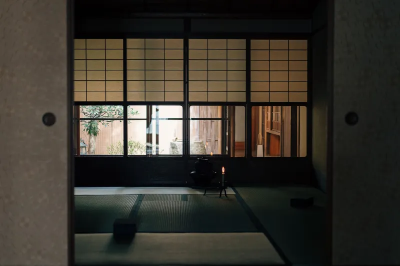
There's a room in traditional Japanese architecture so small it barely fits four people. The ceiling is low on purpose. The entrance — called a nijiriguchi — is deliberately cramped, forcing every guest to bow as they step inside. There are no decorations competing for your attention. A single scroll. A single flower. The sound of water. That's it.
This is the chashitsu, the Japanese tea room, and it has been engineering human connection for about five centuries. No notifications. No noise. Just presence.
Now, in 2024, a growing wave of American creators is looking at that four-and-a-half-mat room and asking a genuinely interesting question: what would it look like if my online space felt like that?
The Problem With Infinite Space
Most digital platforms are built on an anti-tea-room philosophy. More content, more tabs, more feeds, more everything. The logic is that abundance equals value — that if you give people enough stuff, they'll stick around.
But something weird is happening. Audiences are exhausted. Discord servers with ten thousand members feel lonelier than a group chat with twelve. Substacks with daily posts get skimmed. YouTube channels that upload constantly see engagement crater. The infinite scroll promised connection and delivered overwhelm.
What people are actually craving, it turns out, is the opposite of more. They want intentional. They want curated. They want a space that feels like it was designed for them, not just opened up and left running.
That's exactly what the tea room understood before the internet was a concept.
Every Detail Was a Decision
The philosophy behind traditional tea room design — rooted in the aesthetic principles of wabi (rustic simplicity) and sabi (the beauty of impermanence) — treated every element as a deliberate choice. The rough texture of the wall. The particular angle of the window light in the afternoon. The specific way a guest would hear the kettle before they saw it.
None of this was accidental. The tea master Sen no Rikyu, who essentially codified the rules of the tea ceremony in the 16th century, believed that the physical environment shaped the emotional experience completely. Change one element carelessly and you broke the spell.
That same idea — that every design choice is a form of communication — is something a lot of digital creators are only now starting to take seriously.
Think about the creators you actually look forward to checking in on. Chances are their spaces have a specific feeling. A consistent visual language. A pace that's different from everything else in your feed. You don't just consume their work — you enter it. That's not an accident. That's intentional design doing exactly what a tea room does.
The Nijiriguchi Principle: Why Friction Can Be a Feature
One of the most counterintuitive things about the tea room is the tiny entrance. You have to crouch. You have to slow down. You are physically required to leave your ego at the door — originally, this was quite literal, since samurai had to remove their swords to fit through.
In digital terms, this translates to what some creators are now calling intentional friction. A newsletter that publishes once a month instead of every day. A community that requires a brief application or a short intro post before you can join. A Patreon tier that offers fewer posts but longer, more considered ones.
On paper, this sounds like a terrible growth strategy. In practice, it filters for the people who actually want to be there. And those people — the ones who bent down and came through the door anyway — tend to become the most loyal, engaged part of any creative community.
Artist and illustrator communities built on platforms like Geneva or even carefully managed Discord servers are experimenting with exactly this. Smaller member caps. Longer gaps between content drops. Dedicated "quiet" channels where the only rule is no promotion. The feedback from creators running these kinds of spaces is strikingly consistent: the smaller and slower the space, the deeper the connection.
One Scroll, One Flower: Restraint as a Design Language
In a tea room, the tokonoma — a small alcove — holds exactly two things: a hanging scroll and a flower arrangement. These change with the season, the occasion, the guest. But there are never more than two. The restraint isn't laziness. It's respect. It says: these two things are worth your full attention.
For digital creators, this principle translates into something pretty radical right now: doing less, on purpose, and making what you do release feel like an event.
Some creators are moving away from the constant-content model entirely, replacing daily posts with monthly drops that feel more like gallery openings than feed updates. Others are designing their link-in-bio pages to show one thing at a time — one project, one piece, one moment — rather than a scrollable archive of everything they've ever made.
The visual effect is immediately different. It signals that the creator trusts their work enough to let it breathe. And for audiences who are used to being bombarded, that restraint reads as confidence. It reads as care.
Sensory Awareness in a Screen-Based World
Here's where it gets a little philosophical, but stick with me.
The tea ceremony was never just about tea. It was about making people fully present through carefully orchestrated sensory experience. The warmth of the bowl. The smell of the tatami. The sound of water. Every sense engaged, every distraction gently removed.
Obviously, a website can't do all of that. But creators are finding ways to build sensory intentionality into digital spaces in ways that are surprisingly effective. Ambient audio on landing pages. Specific color palettes that signal a particular emotional register before a single word is read. Typography choices that slow reading speed just enough to shift the experience from skimming to absorbing.
Musicians especially are leaning into this — building listening rooms on their websites rather than just embedding Spotify links. Some are releasing music with accompanying visual environments, downloadable wallpapers, or written liner notes that guide the listening experience. The goal is the same as the tea master's: to make you arrive somewhere, not just consume something.
What This Actually Looks Like in Practice
You don't have to rebuild your whole online presence to borrow from the tea room. Start with one thing.
Maybe it's your newsletter — decide on one topic per issue and stick to it, no matter how much you want to add. Maybe it's your community space — set a member limit and actually enforce it. Maybe it's your release schedule — choose a cadence that feels ceremonial rather than frantic, and let your audience look forward to it the way you look forward to a good meal.
The underlying principle is always the same: design for presence, not just traffic. Build a space that asks something of the people who enter it — a little attention, a little slowness, a little willingness to actually be there.
The tea room has been doing this for five hundred years. It's a pretty good blueprint.
And honestly? Given how loud everything else is right now, a little intentional quiet might be exactly what your audience didn't know they were waiting for.