Shadow Work: How Japan's Love of Darkness Is Giving American Creatives Permission to Go Dim
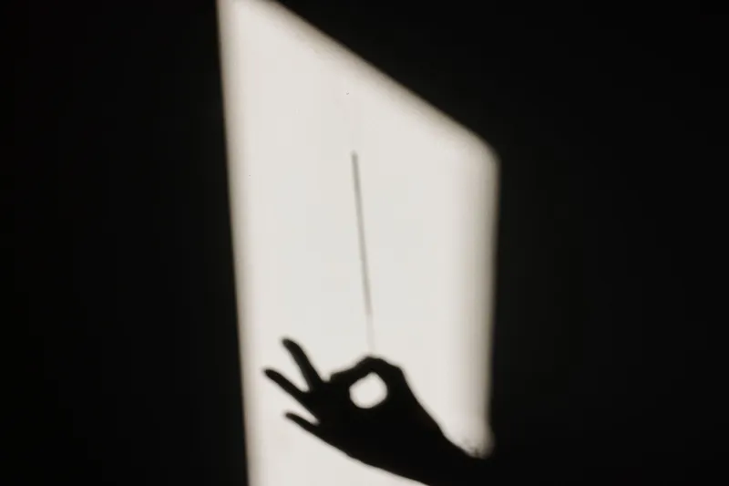
Somewhere between the fifth motivational reel and the third "good vibes only" color palette of the day, something in a lot of us quietly broke. Not in a dramatic way. More like a slow dimming — the creative equivalent of realizing you've been smiling too hard for too long and your face genuinely hurts.
And into that exhaustion, something unexpected has been creeping in. Something darker. Quieter. More honest.
Japanese aesthetics — specifically the ones that have always made room for shadow, impermanence, and a certain beautiful sadness — are finding a deeply receptive audience in American creative spaces right now. And it's not a trend in the surface-level sense. It feels more like a correction.
The Problem With All That Light
American visual culture has been running hot on brightness for years. Think: maximalist pastel branding, hyper-saturated Instagram grids, the relentless cheerfulness of productivity content, the "main character" energy that demands every frame of your life look like a highlight reel. There's an entire aesthetic industrial complex built around the idea that more color, more light, more positivity equals more engagement — and therefore more worth.
But creatives are burning out on it. Designers talk about "brightness fatigue" the way musicians talk about ear fatigue — that point where too much stimulation stops registering as anything at all. When everything is turned up to ten, nothing actually lands.
The response, increasingly, is to go the other direction entirely.
What Japan Has Always Known About Shadow
Jun'ichirō Tanizaki wrote about this almost a century ago. His 1933 essay In Praise of Shadows — which has had a genuine cultural moment in Western design circles over the past few years — argued that Japanese aesthetics derived their beauty not from illumination but from the interplay between light and dark. Lacquerware glowing faintly in candlelight. The particular quality of a room where the corners are allowed to stay dim. The idea that shadow isn't absence — it's texture.
This philosophy runs deep in Japanese visual culture, from the ink wash gradients of sumi-e painting to the low-contrast, muted palettes that characterize so much contemporary Japanese graphic design and album art. It shows up in architecture, in fashion (think the shadow-heavy silhouettes of designers like Yohji Yamamoto), and increasingly in the visual language of Japanese digital creators who are deliberately choosing restraint over spectacle.
The concept of wabi-sabi — finding beauty in imperfection and transience — is part of this same lineage. So is mono no aware, that gentle, aching awareness of how fleeting everything is. These aren't depressive frameworks. They're complete ones. They make room for the full emotional spectrum rather than editing out anything that doesn't test well with an algorithm.
The Creatives Turning the Lights Down
You can see the influence spreading across American creative output if you know what to look for. Graphic designers are moving away from the clean, bright minimalism that dominated the 2010s toward something moodier — deeper shadows, lower contrast, color palettes that feel like they were pulled from old photographs or dimly lit rooms rather than Pantone's trend reports.
Musicians are doing it too. The ambient and lo-fi spaces have always had a Japanese aesthetic undercurrent (the influence of artists like Hiroshi Yoshimura on the lo-fi study beats genre is well documented at this point), but now you're hearing it in indie folk, in bedroom pop, in the kind of slow, interior music that doesn't announce itself. It sits with you instead of performing for you.
Content creators are finding their own version of this shift. There's a growing contingent of American creators — particularly in the 20-to-30 demographic — who are deliberately stepping away from the high-energy, high-production formats that dominate mainstream platforms. Slower videos. Quieter narration. Longer pauses. Visual content that doesn't try to grab you so much as settle beside you.
The comment sections on this kind of content are telling. "I didn't know I needed something this calm." "Why does this feel like exhaling?" "This is the first video I've watched all the way through in months."
Melancholy as Artistic Legitimacy
One of the more significant cultural shifts embedded in all of this is the reframing of melancholy — not as something to be fixed or filtered out, but as a valid emotional register for creative work. American culture has a complicated relationship with sadness. There's a long tradition of pathologizing it, of treating any sustained engagement with darker feelings as a problem to be solved rather than an experience to be understood.
Japanese creative culture has generally been more comfortable with this territory. Mono no aware doesn't ask you to cheer up. It asks you to feel the bittersweetness fully and find the beauty in that feeling itself. It's not wallowing — it's witnessing.
For a generation of American creatives who grew up being told to optimize their mindset and curate their emotional presentation, this is genuinely radical permission. The darkness isn't a bug. It's not a content warning. It's the point.
What This Reveals About Where We're Headed
Generational shifts in aesthetic values tend to reflect something real about what people are collectively processing. The turn toward shadow and restraint in American creative culture right now isn't random. It's happening alongside widespread conversations about burnout, about the costs of performative positivity, about what it means to actually be present versus constantly broadcasting presence.
Japanese aesthetics — with their long history of making philosophical space for impermanence, incompleteness, and the beauty of what's understated — offer a framework that a lot of American creatives are finding genuinely useful. Not as cultural tourism, but as a set of ideas that speak to something they were already feeling but didn't have the language for.
The Kurodami in this site's name means something — kuro for black, dami carrying connotations of depth and weight. It's a name that was never trying to be bright. And right now, that feels less like a niche aesthetic choice and more like it was ahead of something.
The lights are going down. And honestly? It's a relief.